UI measuring units in Android
-
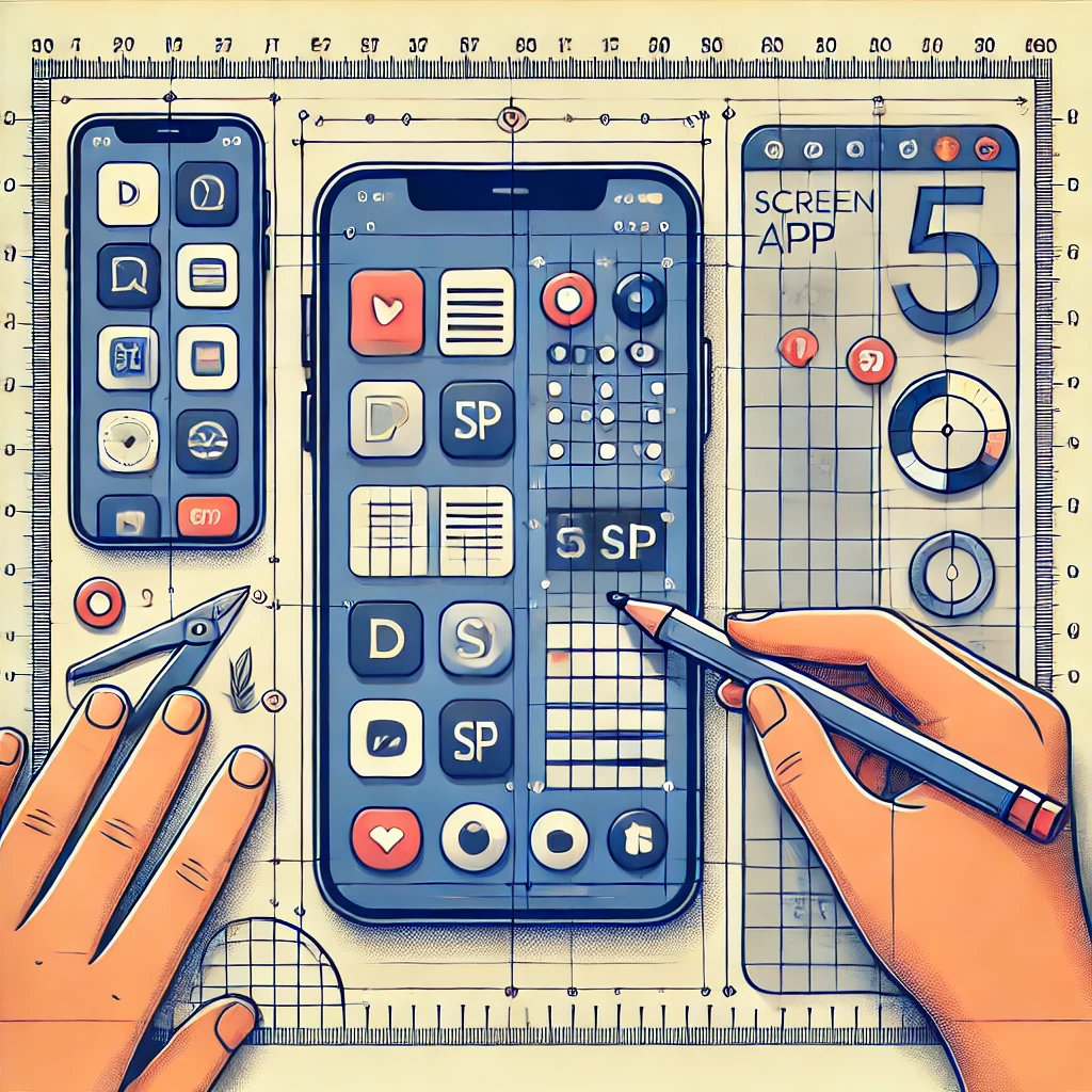
Understanding dp and sp: A Complete Guide to Scalable UI Design in Android
In Android, dp (density-independent pixels) and sp (scale-independent pixels) are two units used to ensure that the UI design scales well across different screen sizes and densities. They help maintain a consistent and user-friendly appearance of elements on devices with varying screen resolutions and sizes. 1. What is dp (Density-Independent Pixel)? Why Use dp? Conversion